6 min to read
python绘图
seaborn
jointplot
代码
import numpy as np, pandas as pd; np.random.seed(0)
import seaborn as sns; sns.set(style="white", color_codes=True)
tips = sns.load_dataset("tips")
g = sns.jointplot(x="total_bill", y="tip", data=tips)
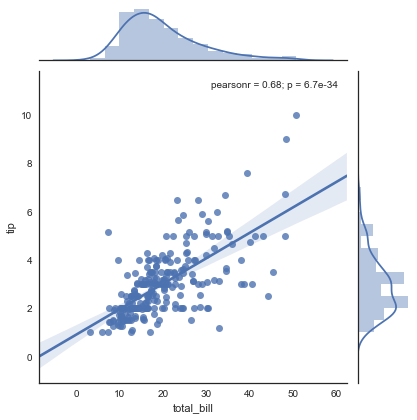
g = sns.jointplot("total_bill", "tip", data=tips, kind="reg")
iris = sns.load_dataset("iris")
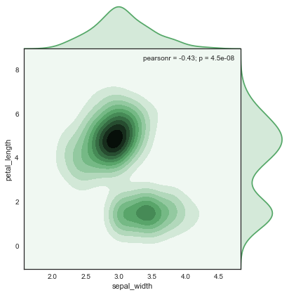
g = sns.jointplot("sepal_width", "petal_length", data=iris,kind="kde", space=0, color="g")
结果
pairplot[02]
import seaborn as sns; sns.set(style="ticks", color_codes=True)
iris = sns.load_dataset("iris")
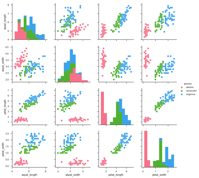
g = sns.pairplot(iris, hue="species", palette="husl")
结果
bokeh
条形图
代码
from bokeh.core.properties import value
from bokeh.io import show, output_file
from bokeh.models import ColumnDataSource
from bokeh.plotting import figure
from bokeh.transform import dodge

output_file("dodged_bars.html")

fruits = ['Apples', 'Pears', 'Nectarines', 'Plums', 'Grapes', 'Strawberries']
years = ['2015', '2016', '2017']

data = {'fruits' : fruits,
        '2015'   : [2, 1, 4, 3, 2, 4],
        '2016'   : [5, 3, 3, 2, 4, 6],
        '2017'   : [3, 2, 4, 4, 5, 3]}

source = ColumnDataSource(data=data)

p = figure(x_range=fruits, y_range=(0, 10), plot_height=250, title="Fruit Counts by Year",
           toolbar_location=None, tools="")

p.vbar(x=dodge('fruits', -0.25, range=p.x_range), top='2015', width=0.2, source=source,
       color="#c9d9d3", legend=value("2015"))

p.vbar(x=dodge('fruits',  0.0,  range=p.x_range), top='2016', width=0.2, source=source,
       color="#718dbf", legend=value("2016"))

p.vbar(x=dodge('fruits',  0.25, range=p.x_range), top='2017', width=0.2, source=source,
       color="#e84d60", legend=value("2017"))

p.x_range.range_padding = 0.1
p.xgrid.grid_line_color = None
p.legend.location = "top_left"
p.legend.orientation = "horizontal"

show(p)
结果

代码
from bokeh.io import output_file, show
from bokeh.models import ColumnDataSource
from bokeh.palettes import GnBu3, OrRd3
from bokeh.plotting import figure

output_file("stacked_split.html")

fruits = ['Apples', 'Pears', 'Nectarines', 'Plums', 'Grapes', 'Strawberries']
years = ["2015", "2016", "2017"]

exports = {'fruits' : fruits,
           '2015'   : [2, 1, 4, 3, 2, 4],
           '2016'   : [5, 3, 4, 2, 4, 6],
           '2017'   : [3, 2, 4, 4, 5, 3]}
imports = {'fruits' : fruits,
           '2015'   : [-1, 0, -1, -3, -2, -1],
           '2016'   : [-2, -1, -3, -1, -2, -2],
           '2017'   : [-1, -2, -1, 0, -2, -2]}

p = figure(y_range=fruits, plot_height=250, x_range=(-16, 16), title="Fruit import/export, by year",
           toolbar_location=None)

p.hbar_stack(years, y='fruits', height=0.9, color=GnBu3, source=ColumnDataSource(exports),
             legend=["%s exports" % x for x in years])

p.hbar_stack(years, y='fruits', height=0.9, color=OrRd3, source=ColumnDataSource(imports),
             legend=["%s imports" % x for x in years])

p.y_range.range_padding = 0.1
p.ygrid.grid_line_color = None
p.legend.location = "top_left"
p.axis.minor_tick_line_color = None
p.outline_line_color = None

show(p)
结果


Comments